How cohesive design across digital platforms builds recognition, trust, and long-term brand value.
One of the strongest lessons digital marketers can learn from luxury brands is the importance of visual consistency. In a world of endless scrolling, visual identity becomes a shortcut to recognition.
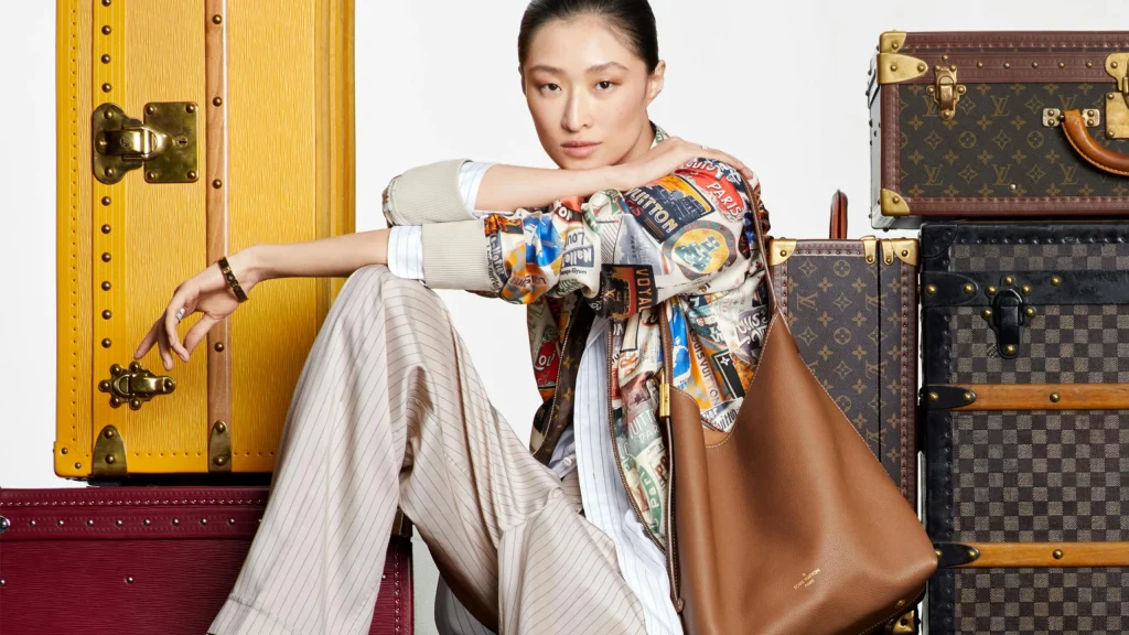
Take Louis Vuitton or Hermès as examples. Their color palettes, typography, photography style, and overall art direction remain highly consistent across Instagram, websites, campaigns, and stores. This consistency creates a seamless brand experience, whether someone is browsing online or walking past a boutique.
In digital marketing, visual consistency builds trust. When a brand looks coherent across platforms, it feels more established and intentional. It signals that every detail is considered, which strengthens perceived quality.
For marketers, this means treating social media feeds, websites, and digital ads as part of the same ecosystem. Fonts, tones, filters, and layouts should feel connected. Over time, this consistency turns visuals into brand assets — people start recognizing the brand even before reading the name.
Luxury brands remind us that design is not decoration; it is strategy made visible.